Basic Slider
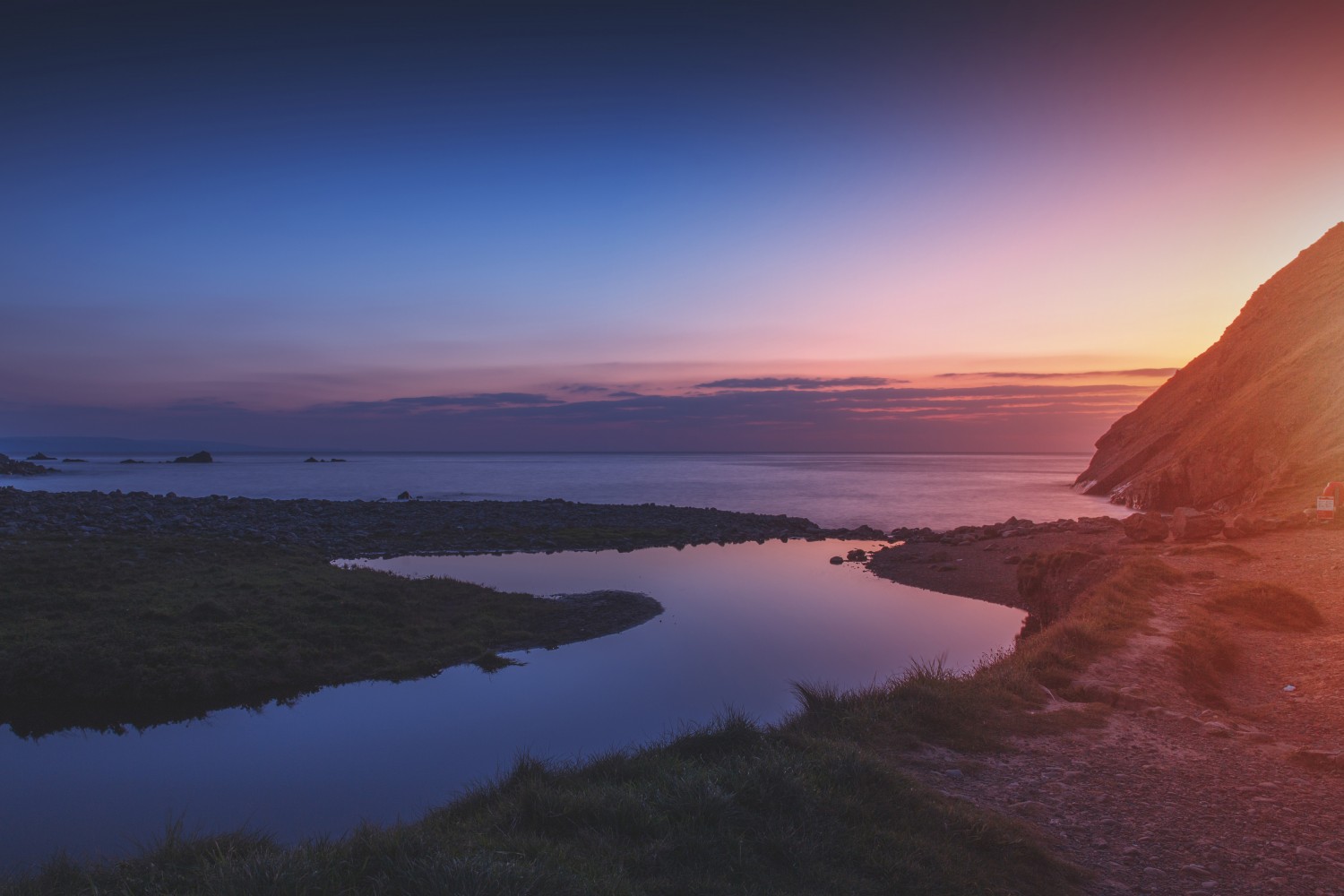
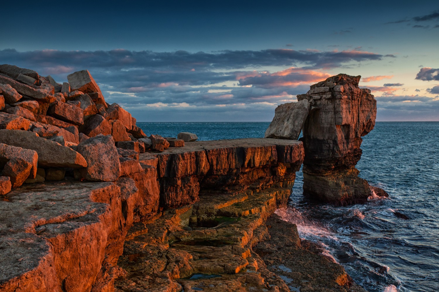
One thing that sets Square1 apart from other sliders is its ability to cleanly present images of any size or shape.
Here are the images used in all of the sliders on this page. Notice that they are a mix of landscape and portrait orientations:

Slider Options & Formatting
Square1 comes with a lot of options for controlling the look and behavior of the slider. You can control the any of these parameters on a slideshow-by-slideshow basis by setting them as an object in the square1() function.
$('.slideshow_formatting').square1({
  width: '200px',
  height: '200px',
  prev_next_nav: 'outside',
  dots_nav: 'outside',
  caption: 'none'
});
Slider Options
| Option | Default | Description |
|---|---|---|
width |
'' |
Any CSS measurement. Blank defaults to CSS or auto. |
height |
'' |
Any CSS measurement. Blank defaults to CSS or the height of the first image. |
animation |
'fade' |
'fade' or 'slide' |
fill_mode |
'cover' |
'contain' or 'cover' |
scale_from |
'center center' |
Any value valid for the CSS background-position property. |
start_delay |
0 |
Delay (ms) before the slideshow starts. |
slide_duration |
4000 |
Time (ms) each slide is shown. |
transition_time |
500 |
Duration (ms) of the transition between slides. |
lazy_load |
false |
If true, load each image only when needed. |
auto_start |
true |
Start the slideshow automatically. |
pause_on_hover |
false |
Pause the slideshow when the user hovers over it. |
keyboard |
true |
Enable arrow-key navigation. |
gestures |
true |
Enable touch/swipe gestures. |
theme |
'dark' |
UI theme; e.g. 'dark' or 'light'. |
background |
'none' |
CSS background for the slider container. |
prev_next_nav |
'inside' |
'inside', 'outside', 'hover', or 'none'. |
dots_nav |
'inside' |
'inside', 'outside', 'hover', or 'none'. |
caption |
'outside' |
'inside', 'outside', 'hover', or 'none'. |
onLoad |
function() {} |
Callback when all images have loaded. |
onPlay |
function() {} |
Callback when the slideshow starts playing. |
onStop |
function() {} |
Callback when the slideshow stops. |
onChange |
function() {} |
Callback when the slide changes. |
Slider Size and Aspect Ratio
You can control the size of the slider by setting the width and height options.
$('.slideshow').square1({
  width: '200px',
  height: '200px'
});
You can also set the aspect ratio of the slider by setting the aspect_ratio option.
$('.slideshow').square1({
  aspect_ratio: '16/9'
});
If no width or height is set, the slider will default to the size of the first image.
fill_mode
The fill_mode property will let you control how and how much of your images people see. The default value is "cover", which resizes and crops images to make sure the slider is always filled.
To create a slideshow, simply create a container element filled with images in your HTML:
<div class="slideshow">
  <img src="image1.png" alt="Image Description 1" caption="Caption 1">
  <img src="image2.png" alt="Image Description 2" caption="Caption 2">
  <img src="image3.png" alt="Image Description 3" caption="Caption 3">
</div>
... And convert it to a sqaure1 slider by calling the square1() function in your javascript:
$('.slideshow').square1();
The alternative fill_mode option is "contain," will resize each image so that it fits completely inside the slideshow.
$('.slideshow_contain').square1({
  fill_mode: 'contain'
});
animation
Transitions can either be set to a cross-fade (default) or a 'slide' animation like this one here:
$('.slideshow_slide').square1({
  animation: 'slide'
});
theme
Square1 also comes with a 'light' theme for use on darker images and sites
$('.slideshow_light').square1({
  theme: 'light'
});
Controls Positioning
You can control the position of the controls (previous, next, dots) by setting the prev_next_nav and dots_nav options.
$('.slideshow_controls').square1({
  prev_next_nav: 'outside',
  dots_nav: 'outside'
});
Image Positioning
If you are using the default "cover" fill mode to scale your images, you can set the point from which the image should scale from (ie. which corner of the image will be pinned in place if parts of the image need to be scaled and cropped). You can use any values that work with the CSS [background-position](https://www.w3schools.com/cssref/pr_background-position.asp) property.
$('.slideshow_scalefrom').square1({
  scale_from: 'bottom right'
});
And you can set this on an image-by-image basis by adding the 'scale-from' attribute to your images (resize your browser to see the result):
<div class="slideshow_scalefrom">
  <img src="image1.png" alt="Caption 1" scale-from="bottom left">
  <img src="image2.png" alt="Caption 2" scale-from="top right">
  <img src="image3.png" alt="Caption 3">
</div>
Slider w/ Non-Image Elements
You can also make slides out of more things other than images, such as iframes or more complex HTML structures. Square1 will use the first `img` tag in each child element as the background of that slide. If no image is found, the child element will be used as as the slide content.
<div class="slideshow">
  <div>
    <img src="image1.png" alt="Image Description" caption="Caption 1">
    <div>HTML Content</div>
  </div>
  <div>
    <img src="image1.png" alt="Image Description" caption="Caption 1">
    <h3>Slide Title</h3>
  </div>
  <div>
    <img src="image1.png" alt="Image Description" caption="Caption 1">
    <h3>Slide Title</h3>
  </div>
</div>
Aenean pellentesque diam
Lorem ipsum dolor sit amet consectetur, adipisicing elit...
Events
With built in events and callbacks, you can also control and respond to events in the slideshow however you want.
$('.slideshow_events').square1({
  auto_start: false,
  onPlay: function() { $('.status').html('Playing');},
  onStop: function() { $('.status').html('Stopped');},
  onChange: function() { $('.status').html('Changing slides');},
});


// BUTTONS
$('.play').click(function() {
  $('.slideshow_events').square1('play');
});

$('.stop').click(function() {
  $('.slideshow_events').square1('stop');
});

$('.next_slide').click(function() {
  $('.slideshow_events').square1('next');
});

// Jump to Slide 3
$('.slide3').click(function() {
  $('.slideshow_events').square1(3);
});
Responsive Images
Square1 supports srcset right out of the box. Just create your various image sizes, add 'srcset' (and the optional 'size') attributes to your img tags and square1 will load the appropriately sized images as needed.
<div class="slideshow_srcset">
  <img src="image1.png"
    srcset="image1-sm.jpg 400w, image1-md.jpg 800w, image1.jpg 1200w"
    sizes="(max-width: 500px) 400px, (max-width: 1200px) 800px, 1200px"
    alt="Caption 1">
    ...
</div>
Sequential and Lazy Loading
Square1 will try to automatically stagger the downloading of images to make pages load faster and start playing sooner. To prevent the browser from trying to fetch images too early, add 'data-' before any 'src' and 'srcset' attributes on any images you want delayed. Square1 will convert the attributes at the appropriate time.
<div class="slideshow">
  <img src="image1.png" srcset="image1-sm.jpg 400w" alt="Caption 1">
  <img data-src="image2.png" data-srcset="image2-sm.jpg 400w" alt="Caption 2">
  <img data-src="image3.png" data-srcset="image3-sm.jpg 400w" alt="Caption 3">
</div>
In cases where there are a lot of big images or complex animations, you might want to delay image loading even more. You can tell square1 to load each image only when it's needed ("lazy loading") by setting the 'lazy_load' option to true.
$('.slideshow_srcset').square1({
  lazy_load: true
});
Note: You must add the 'data-' prefix to the 'src' and 'srcset' attributes as mentioned above for lazy or sequential loading to work.